
Launching a Tyre Brand Digitally
E-COMMERCE | UI/UX | DESIGN SYSTEMS
Building a website for a tyre manufacturing company looking to expand digitally by making their products and services available online.
Project Context
Aug - Nov 2020
Work for Fractal Ink Design & Consultancy
Team : Senior UI Designer (me), UI designer, UX Lead, UX Designer, Development team
Role & Responsibilities
Design Direction
UI Design and patterns
Making and maintaining a Design System
Managing Deliverables
Client Communication
Tools Used
Sketch
Photoshop
Miro
Zeplin
Project Brief
The brief for this project was to build a website for a tyre manufacturing company looking to expand digitally by making their products and services available online.
With the desire to be accessible across platforms and devices, the website was envisioned with the premise of being responsive and catering to buying of products.

An excerpt from the initial moodboard
Approach
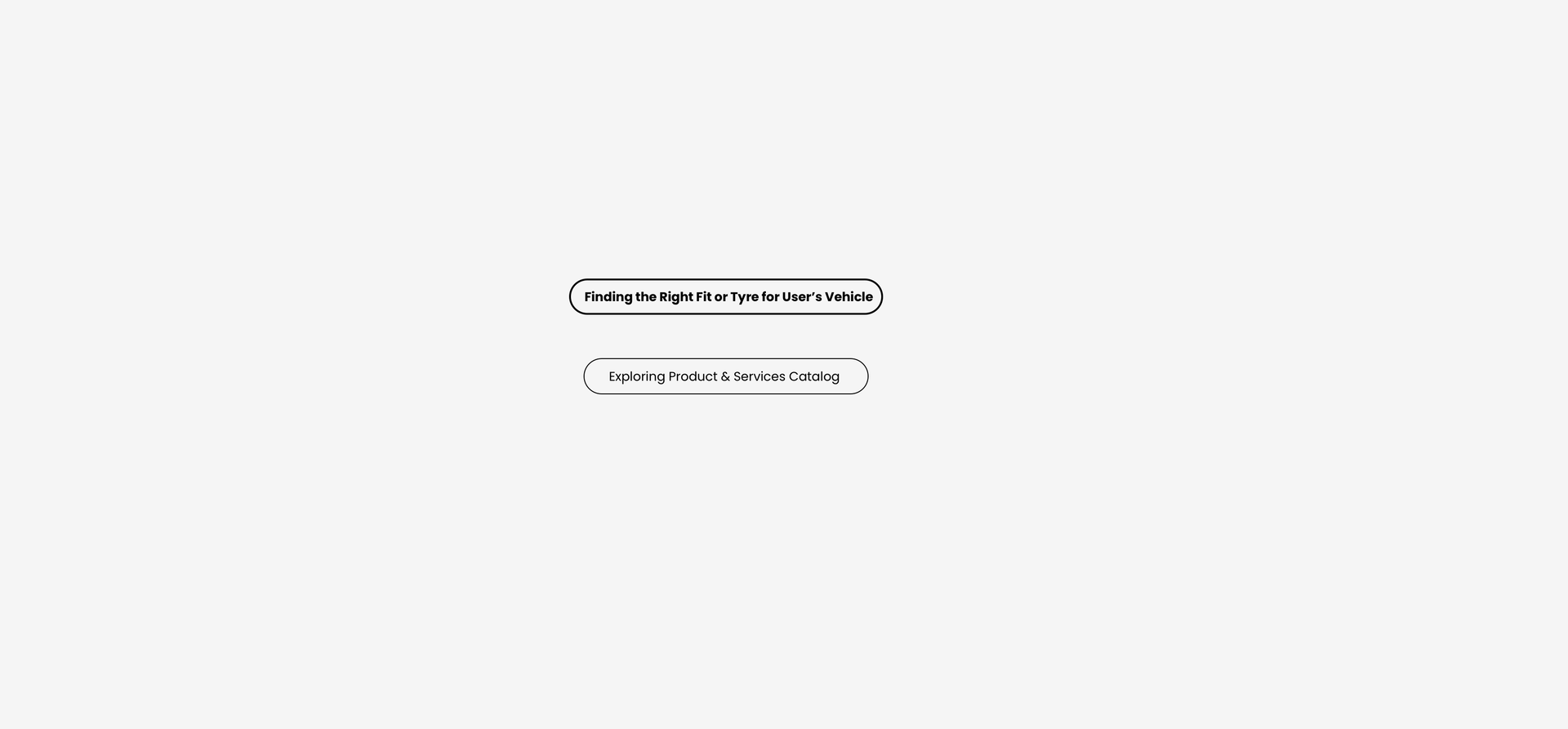
It was interesting to get to know customer behaviour around a product like tyres. The frequency of buying, information to be provided prior to purchase as well as expected services were quite different from common e-commerce platforms.
In order to build a website that caters to this uniqueness, we had to think beyond traditional e-commerce. This along with user-centricity and business goals gave rise to features such as recommendation models, vehicle compatibility check, tyre size guide, registration for warranty, etc.

Some experience goals translated to user-centric features

Design
As a senior interface designer, I was responsible for establishing the design language while balancing product showcase, brand guidelines and information hierarchy.
Here are somethings that guided the design language:
-
Early discussions with the client focused on keywords like bold, clean, sporty, accessible, and product-oriented, guiding the visual concept to spotlight tyres.
-
The design was kept minimal and clean to highlight product images and marketing campaigns.
-
Brand colours were used in cards and icons to maintain consistent brand presence throughout the website.
-
Components & patterns were identified and scaled across devices for consistency
-
Some playful interactions were introduced to engage the user wherever necessary and possible

Overall visual language and brand direction
Iterations
Extending the visual language to the many features of the website was a creatively satisfying task but it wasn’t without its challenges. Often, designs for some features would have to be reimagined, redesigned or even scrapped due to user testing, client feedback or technical limitations


Evolution of Product Cards and The Tyre Recommender through iteration & testing
Execution
Aside from the extending and maintaining the design language for this project, I worked closely with a team of developers as well as the client to track progress and manage timelines and deliverables.
Having been a part of this project from concept to launch was a great learning experience
Journey of some experience goals from conception to final execution

Adapted designs for desktop and tablet
Challenges and Learnings
-
This project provided a well-rounded experience, allowing me to design new content types, manage teams, and handle client communication.
-
I was involved in the design team from start to finish, gaining insight into all project stages and their demands.
-
I learnt the importance of scalability by designing templated pages and components for the website.
-
Close collaboration with the development team made me aware of technical limitations, enhancing my understanding of front-end interface design.
-
Managing team and client communication was a new challenge, where I quickly learned the value of visual solutioning with collaborative tools like Miro.
Success of the Project
This project had 4M unique visitors in its debut year
It was also entered in the India’s Best Design Awards 2021 contest and won under the Best Design Projects Category.