On a Lighter Note
GRAPHIC DESIGN | ILLUSTRATION | STORYTELLING
On a lighter note is a short, illustrated e-book about body acceptance.
Project Context
Aug 2020
Self-initiated Collaborative Project
Team : Poonam Patel & I
Role & Responsibilities
Illustration
Graphic Design
Publication Design
Social Media & Kickstarter Campaign
Tools Used
Adobe Photoshop
Adobe Illustrator
Adobe Indesign
Project Brief
Written and art directed by Poonam Patel, this book shares her experiences and struggles of having and living with Vitiligo, an auto-immune condition characterised by skin pigmentation. The book traces Poonam’s attempts to confront and accept her condition by sharing the inner workings of her mind via image and text.
As an illustrator and collaborator on this project, my task was to visualise and craft images that would help communicate all the different, wide ranging moods and emotions of this journey while keeping the author’s experience and vision central.
I am grateful to Poonam for choosing me to help her share her story via this empowering project. By being a part of this project I have learnt more about body neutrality and compassion along with gaining insights relating to collaboration, self-publishing and crowdfunding.
Find more details about the kickstarter campaign here
Find us on instagram here
Process / Approach
I was really excited to collaborate on this project as it felt like my first big piece of illustrative and narrative driven work outside of college. Having known Poonam practically all my life, the gravity of her decision to share her experiences wasn’t lost on me.
In order to be able to create images that would reflect the lived experiences, my approach was to have the text as my primary source of reference.
I would go through the drafts, highlight parts that would translate well visually, sketch my first impressions/ideas as thumbnails and then align with the author about which of these ideas matched her vision. Being in different time zones, we made use of collaborative tools such as google docs and freehand to sync our ideas and thoughts.


Initial ideas and thoughts as drawings; Multiple colour and style variations to hit upon the apt 'mood/vibe'
STYLE & COLOUR
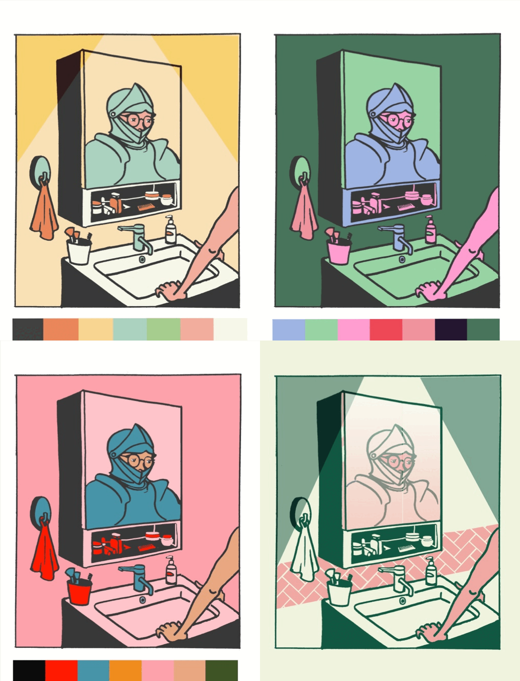
We spent some time trying to figure out the exact style of illustration and the colour palette that would complement the candid, vulnerable, sometimes humorous and most times serious tone of the text.
The palette, predominantly consisting of greens and pinks was chosen to sooth the eye but also take away from a kind of realism. This abstraction helped me use the colours, their shades and tints to showcase the varying moods in the book without worrying about ‘actual’ colours and balancing them in the compositions.
STORYBOARDING
While the illustrations had to make sense for each page’s content, they also had to correlate sequentially with the overall narrative. To create this continuity in the experience of the book across image, text and layout, storyboarding was a critical part of the process.
This exercise changed quite a few of our initial ideas. However, thanks to it, looking at the whole book as a draft gave us fresh perspective and helped me finalise layouts for each page.


Brainstorming ideas through shared material, photographs and the text; Storyboarding spreads to plan the flow of the book
FINAL EXECUTION
After the ideation and storyboarding process, executing the final illustrations became easier.
Since the layout and compositions were more or less decided, I drew out the images by hand and scanned them to colour-in digitally. While some illustrations were easier to finish, some proved to be difficult to nail in terms of either details or mood.
But with prompt feedback and direction from Poonam, I was able to produce desired results. The very last stage of this project involved laying the illustrations and text out in a book format as well as formatting the files to necessary technical configurations for easy and glitch-free viewing of the e-book.

The process of arriving at each spread from inspiration to final execution
Challenges & Learnings
-
This project was a collaboration across countries (US and India) which came with its own challenges like time differences, being able to share resources and material online only, etc.
-
The earlier possibility of a physically printed book was compromised due to COVID lockdowns in both countries
-
As an illustrator, the first and main challenge was about figuring out what would be an accurate but considerate representation of the condition itself. After lots of debate and discussion we decided to include a character with armour.
-
The process of working on this project involved working with deeply personal and intimate experiences (also, not my own), which has taught me alot about being sensitive with the material that is shared with me.
-
It was initially challenging to come to a consensus on visual interpretations that conveyed the exact feelings of the lived experiences. However, once we found common ground and clarity in the vision, the process fell into a rhythm. Creating images/compositions which have enough depth and meaning to support the text was the most effort intensive yet fun and satisfying task. We were keen to come up with ideas and visual metaphors that would communicate but also have a sense of visual play, interest and intrigue. Through this exercise, I have learnt more about collaboration and the importance of listening well, as well.

Some details from the final spreads
Success of the Project
We were able to publish this e-book through crowd-funding via Kickstarter. This project was also featured on Kickstarter’s Inside Voices initiative.